“I have gotten so many compliments on my new
branding from clients and service providers I work with,
it's finally FUN to share my website and branding
with the world! Kevin absolutely nailed it.”
branding from clients and service providers I work with,
it's finally FUN to share my website and branding
with the world! Kevin absolutely nailed it.”
Niamh Donoghue – The Single Thread
The Single Thread is the nom de plume of independent and nomadic brand marketing consultant Niamh Donoghue. From supporting tech startups to working with companies like Asana and Hewlett Packard, Niamh specialises in go-to-market product strategies. Employing audience research, repeatable messaging and company training, Niamh ensures the entire business is saying the same thing – the single thread that runs through the entire brand.

More
The perfect visual metaphor
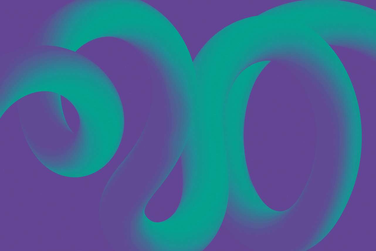
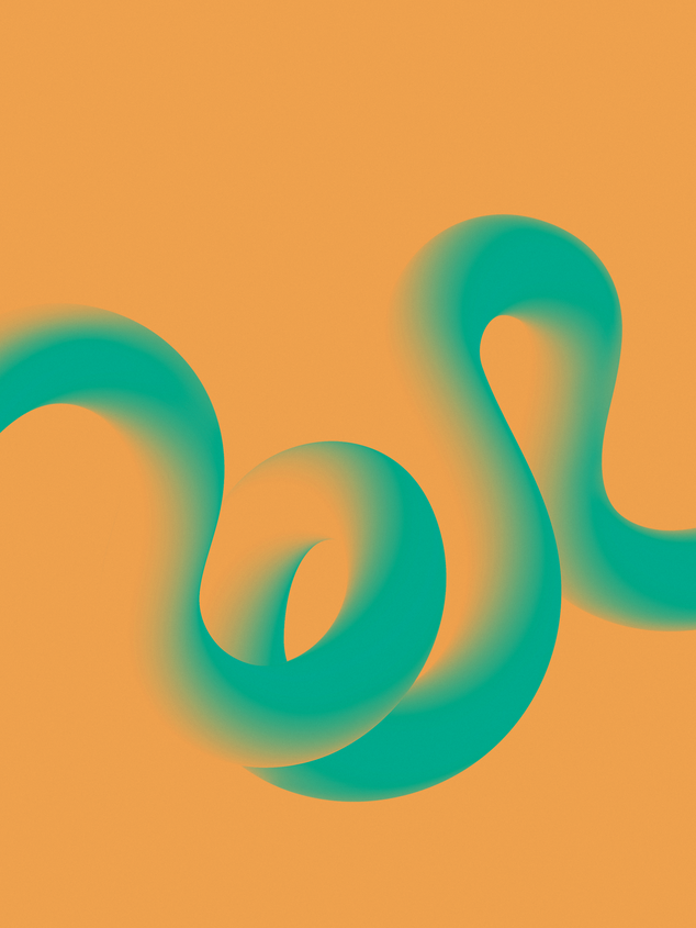
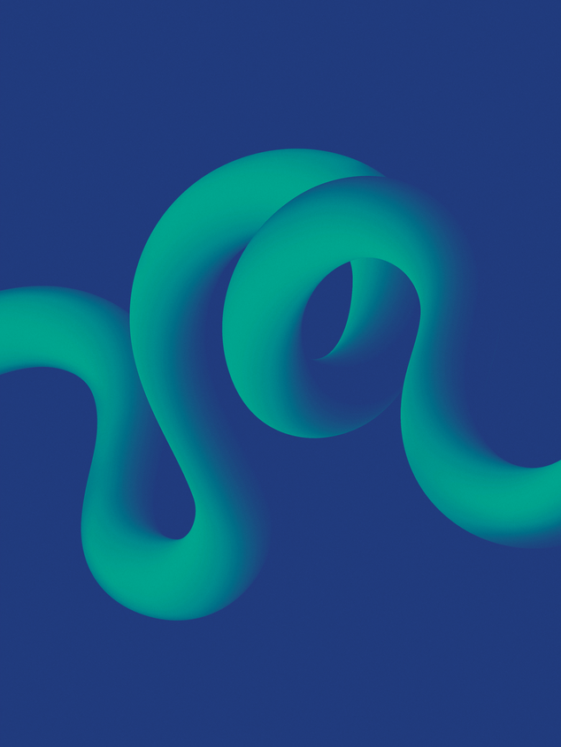
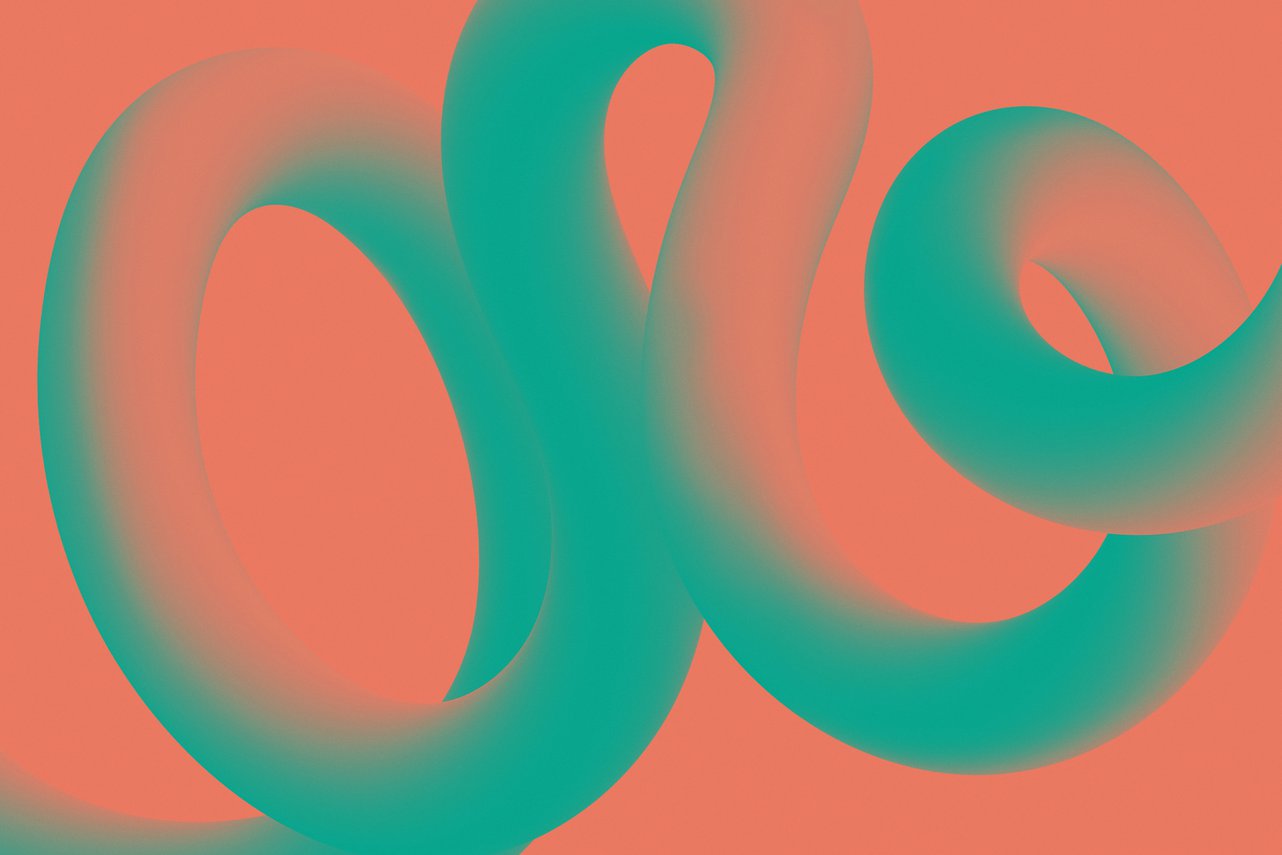
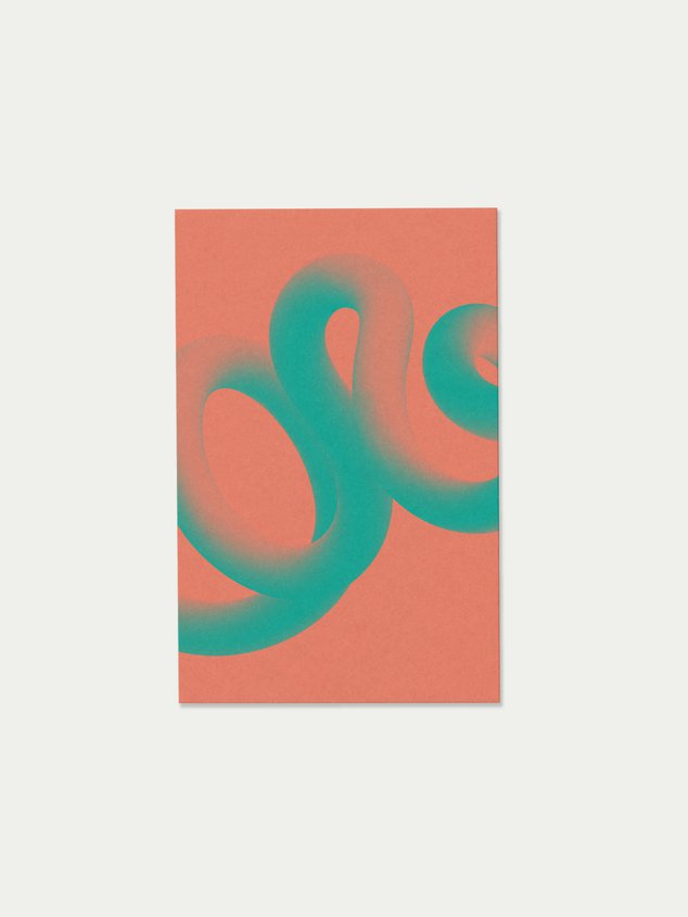
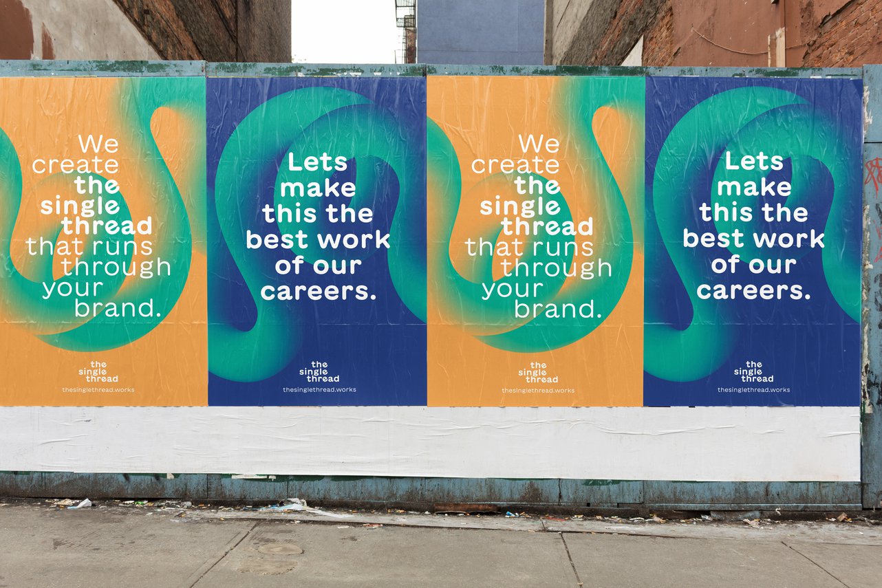
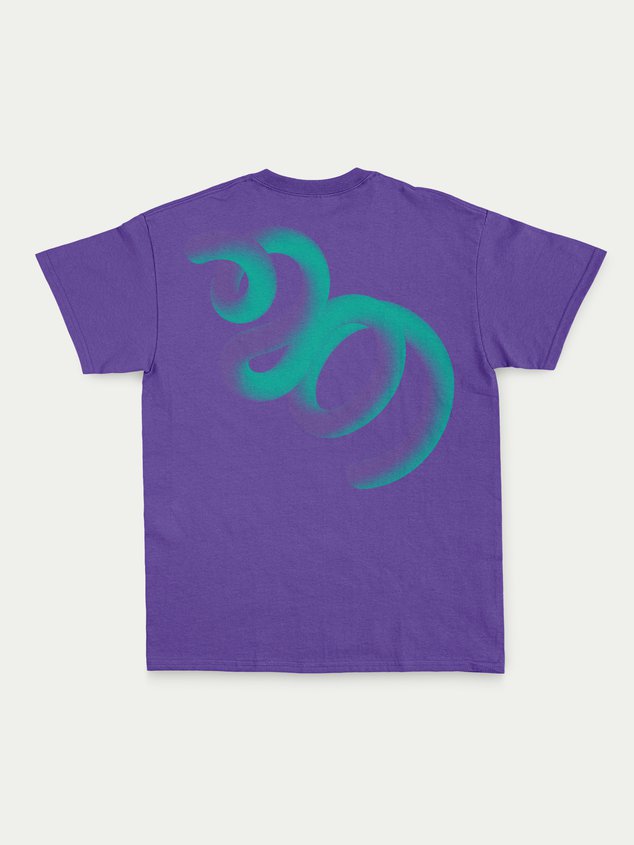
Niamh’s business had been built on word of mouth and a growing reputation. However, the time had come to solidify her offering and the clients she wished to work with. We were tasked with creating a visual identity and website that visually communicates her ethos and proposition. As we discussed her verbal identity and thoughts around her business I was struck by a line of copy that outlined Niamh’s philosophy perfectly – ‘we create the single thread that runs through your brand’. My mind instantly recalled a set of images I’d seen months ago of twisting neon tubes. Taking these as inspiration, we recreated colourful sensory stress noodles with smooth curves and consistent form. No matter how complicated the twisting, turning and knotting, you could always follow the thread from beginning to end, turning these generic play things into the perfect visual metaphor.
Small touches cast memorable shadows
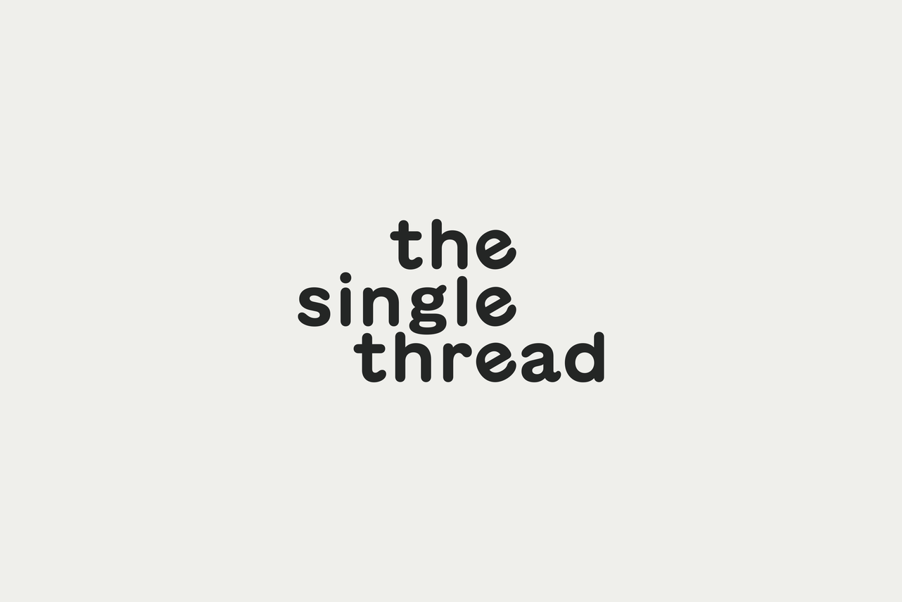
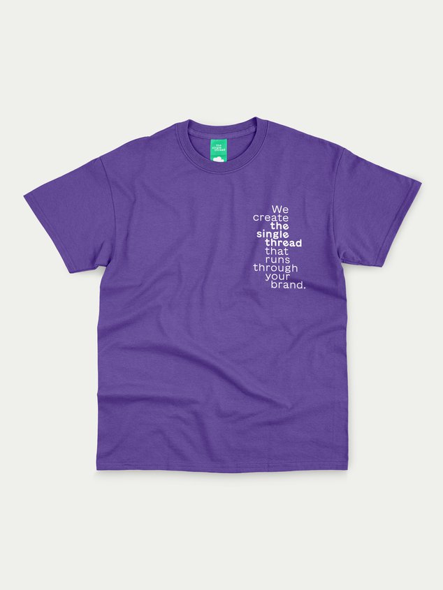
‘The single thread that runs through your brand’ is the theme that permeates everything Niamh does, so it makes sense that this is embedded into the design language. Utilising a typeface based on Japanese hand painted construction signs not only mirrored the aesthetics of the thread but also reflected Niamh’s creative, adventurous and fun side. The concept of a single thread was accentuated in the wordmark by aligning and gently rotating the letter ‘e’, creating a single thread in and of itself. We also used colour to emphasise this further by employing a solitary colour for the threads with a concise complimentary supporting palette.
The solid rock of truth
The groundwork Niamh undertook provided the foundations on which Points could build a visual identity. One that clearly communicates her personality and philosophies with prospective clients but also creates an identifiable and adaptable look and feel across all touch points. It has allowed Niamh to confidently move beyond the role of product marketing consultant and niche down on the area of marketing that excites her most, helping businesses find their single thread. Since the launch of the new brand 6 months ago, Niamh has secured her most aligned clients to date and is on track to have her most profitable year yet.
Assembled Team
Illustration :: Tara Peak
What we did
Art Direction
Illustration
Logo Design
Project Management
Visual Identity
Squarespace Website
Illustration
Logo Design
Project Management
Visual Identity
Squarespace Website
02 04
26
GMT
These are a few projects we've done for others. If you're curious to see what we can do for you, we'd love to talk.
