“I love working with Kevin. He is a designer who
understands branding yet has the heart and
rebelliousness of an artist. What sets him apart is
the breadth of his influences, the depth of his thinking
and his genuine passion for creativity. This is the
second time I’ve engaged him for a rebrand and it’s the
second time I’ve been blown away by the results.”
Seth Rowden – Seth Rowden Ltd
Seth is a brand writer and strategic thinker specialising in the verbal part of branding. Since 2012, he has created mission-critical language for international brands in tech, fintech, retail, social impact and lifestyle sectors. After years of partnering with Seth on a number of projects, and him being a good friend of the studio, I was more than happy to step in to refine and refresh his positioning.

More
A confident approach for a confident proposition
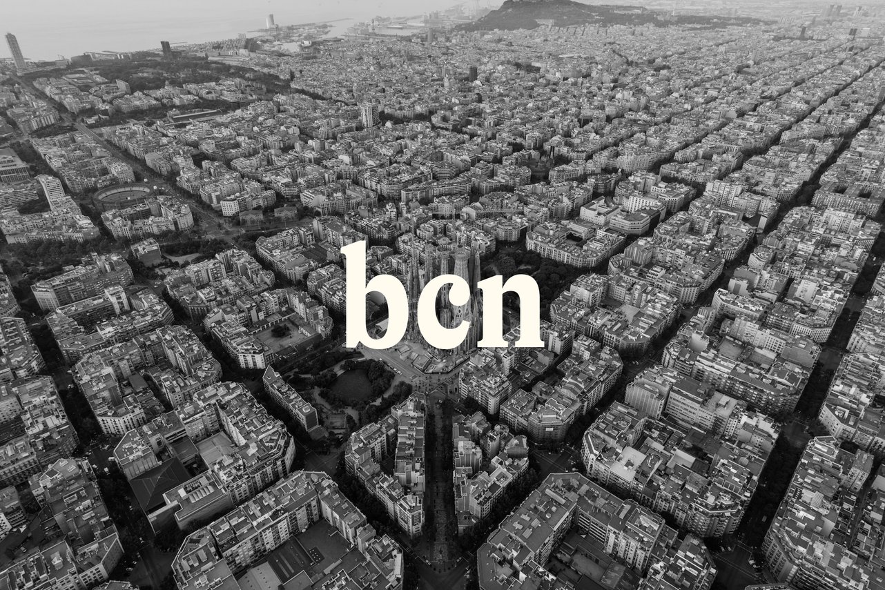
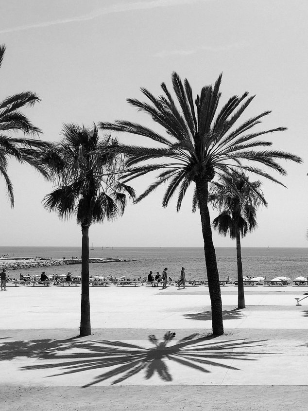
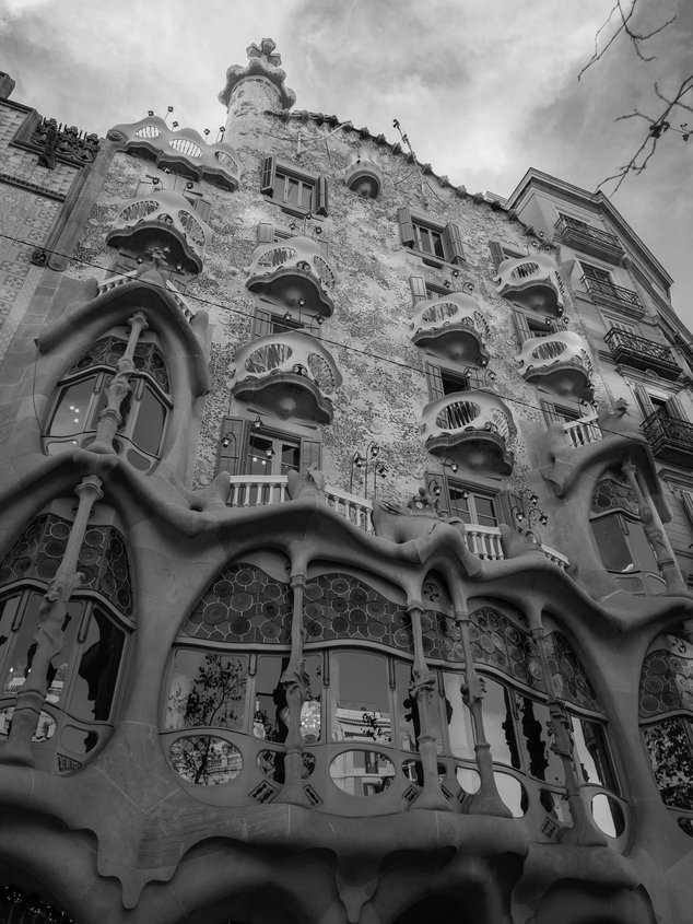
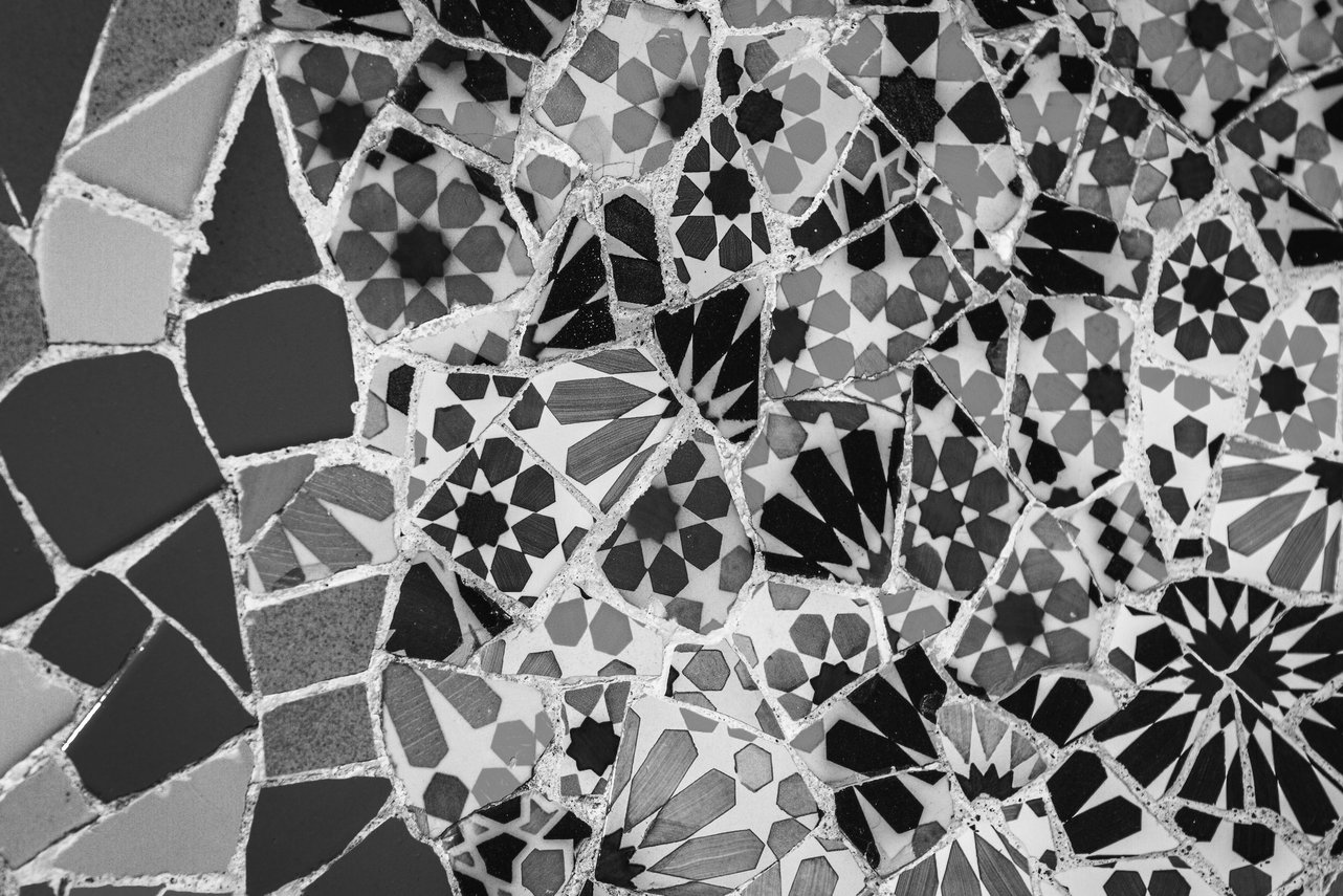
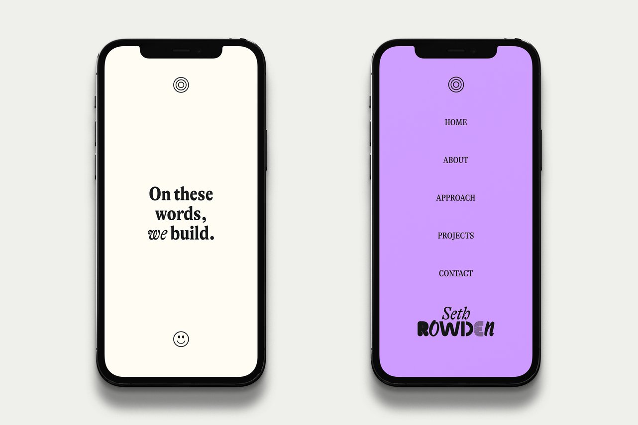
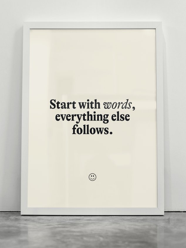
To be authentic, the design had to support Seth’s words-first approach without overpowering the proposition. The challenge was to create an engaging, characterful and memorable visual identity without leaning heavily on visual assets. Through hours of conversations – which are rarely short and always peppered with observations, inspirations and recommendations – we began to hone in on a brief. It’s this level of curiosity and desire to get right down into the weeds that unlocked the door, leading us to hit on a single word brief: ‘Barcelona’. As simplistic as may sound, ‘Barcelona’ became the perfect cipher. For Seth and I, the name was loaded with complexity and meaning, providing the source from which everything flowed.
Just a touch
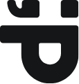
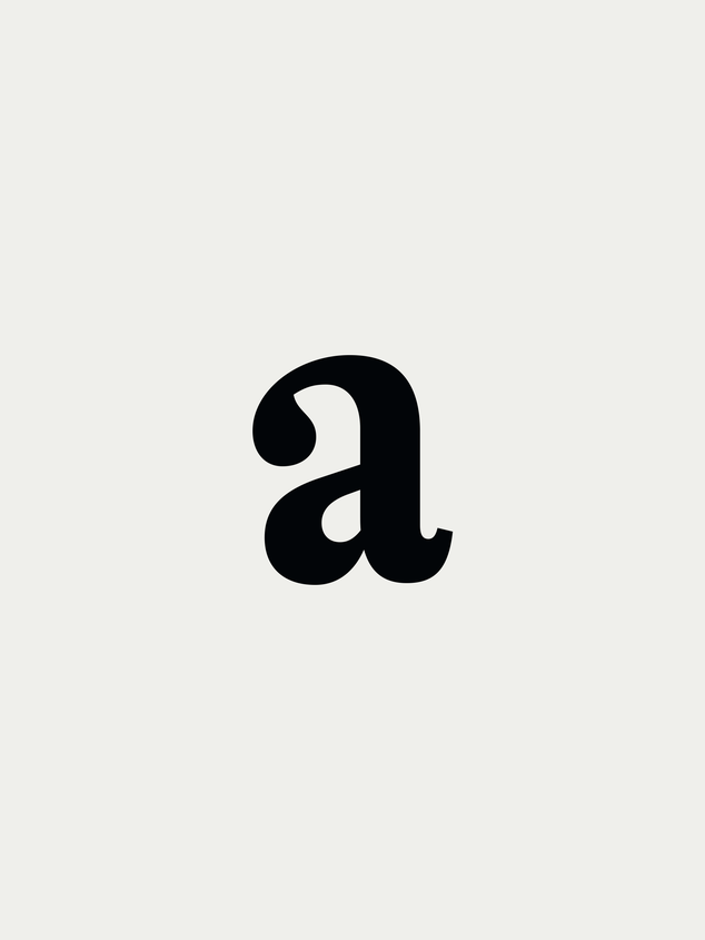
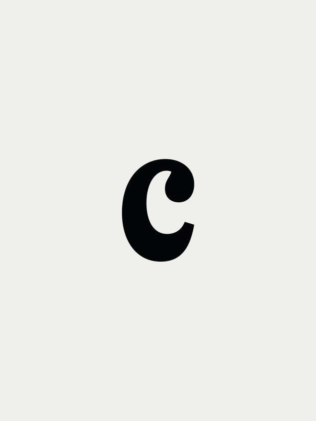
Since the site concept was anchored around words, we started with type. The bold typography paired with a monochromatic colour palette may be reminiscent of classic print ads of the past but the typeface was 100% ‘Barcelona’. The expressive shapes and quirky, overemphasised balls and terminals provide both character and personality. It’s bold and self assured yet has this undeniable bonhomie. By placing the copy front and centre and allowing the typeface to do the talking, we created a striking yet incredibly approachable identity that honours Seth’s words-first approach to branding.
As for the wordmark, it was inspired by the beautiful array of mismatched tiles found throughout the city and the variety of unique brand voices Seth conjures up for his clients. And the smiley? If you’re lucky enough to meet Seth, you’ll understand.
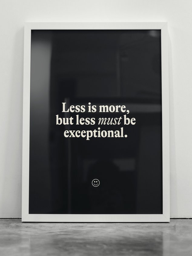
Less is more, but less must be exceptional
Being visually bombarded and overstimulated can be exhilarating. It can also be deafening. Seth’s ‘less is more’ approach to the written word invited us to strip away the superfluous and kill the noise. What’s left is exactly what was needed. After designing, building and launching the site, we also re-designed deck templates that elevated the presentation of Seth’s work and increased profitability.
Assembled Team
Animation :: Tara Peak
Website Development :: Designers’ Friend
Website Development :: Designers’ Friend
What we did
Animation
Art Direction
Illustration
Logo Design
Project Management
Visual Identity
Website Design & Development
Art Direction
Illustration
Logo Design
Project Management
Visual Identity
Website Design & Development
20 07
26
GMT
These are a few projects we've done for others. If you're curious to see what we can do for you, we'd love to talk.