“If only we could have worked with Points
on every release as their approach and
ideas were second to none. They listened
to our vision and needs, then cranked
the creativity up to 11.”
on every release as their approach and
ideas were second to none. They listened
to our vision and needs, then cranked
the creativity up to 11.”
Dave Philpot – Skint Records
Skint Records is a Brighton-based label that was at the forefront of the 90s big beat music scene. They signed some of the most influential artists of the day – names such as Fat Boy Slim, Hardknox, Freq Nasty and X-Press. Throughout the 00s, they expanded the artists and musical genres associated with the label and scored multiple chart successes, including number ones in both the UK’s singles and album charts. These were hard decades when the music industry went through massive changes. Skint Records changed with the times without ever missing a beat, adapting to new music formats and the advent of streaming.

More
Celebrating 15 years of dance music hedonism.
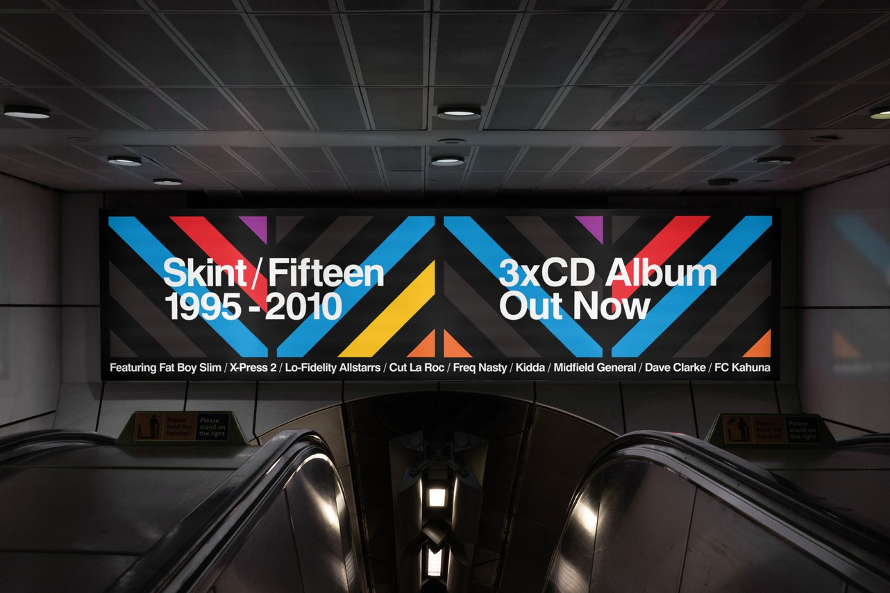
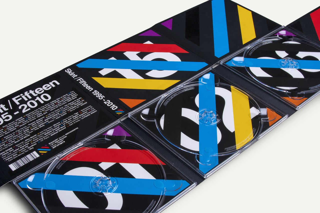
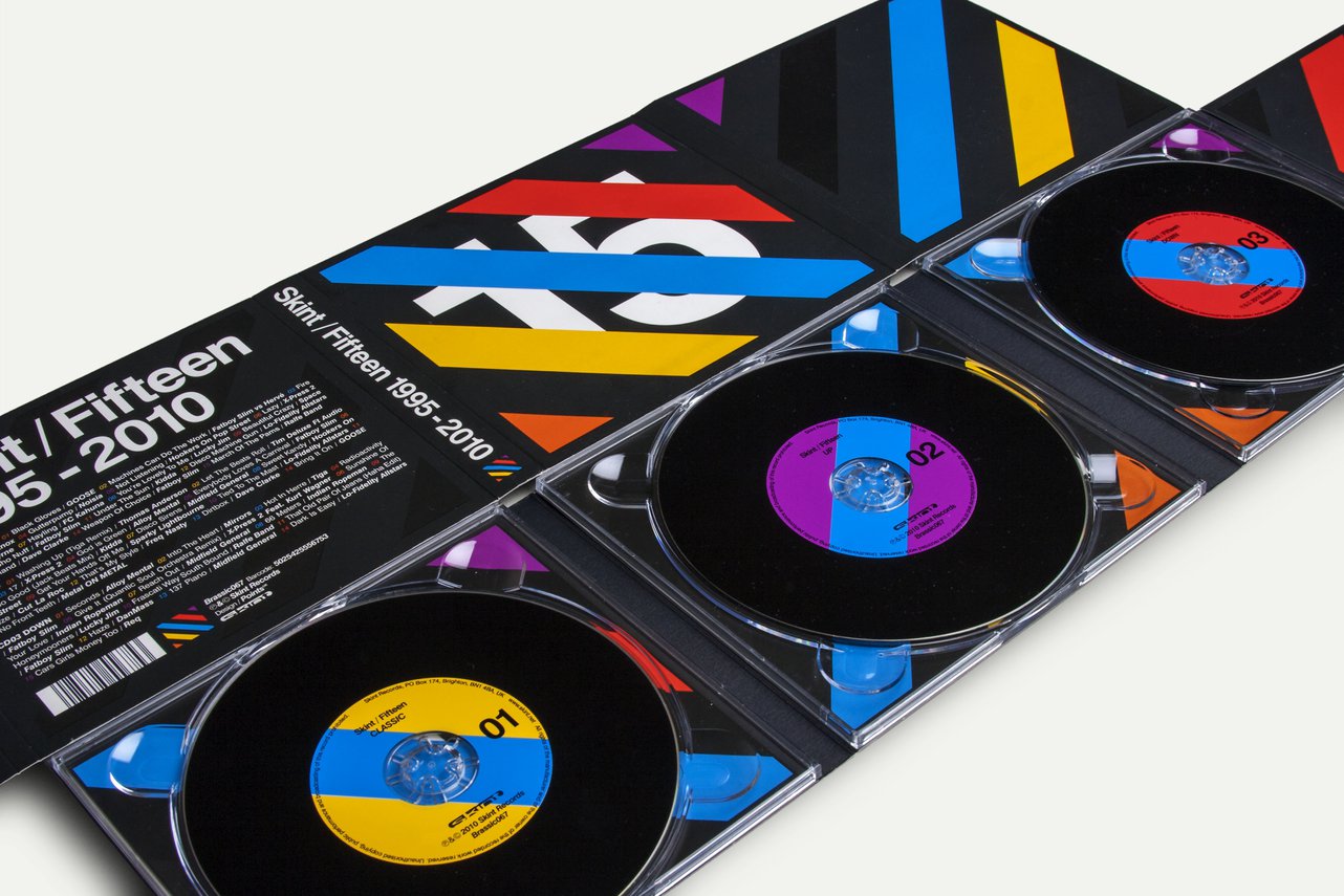
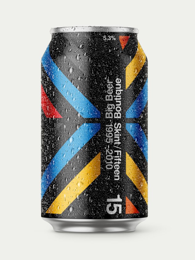
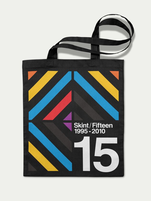
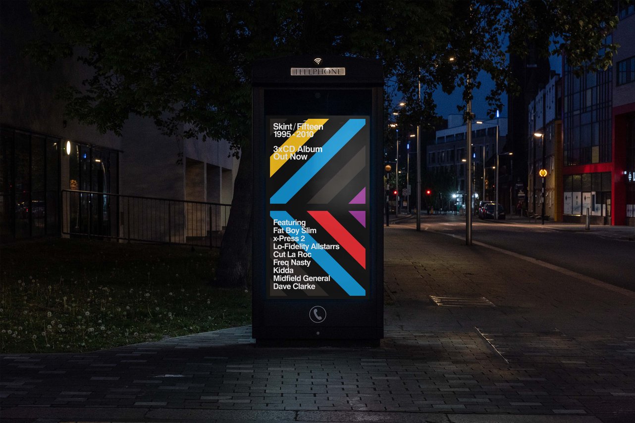
Our challenge was clear. We took on the task of developing a milestone campaign to commemorate a fifteen-year period of dance music hedonism (that’s as eclectic as a fashionista’s wardrobe), in one all-encompassing, nostalgia-free, eyeball-grabbing celebration. Our ambition was to spread awareness of Skint Records by launching a marketing campaign that was as counter-culture as the brand itself.
We settled on a solution that was blindingly obvious.
If Skint were a stick of Brighton rock, you’d find “dance music” running right through the middle. Sure, there’d been deviations into other sounds but at their core, they were a party label making bangers for the dance floor.
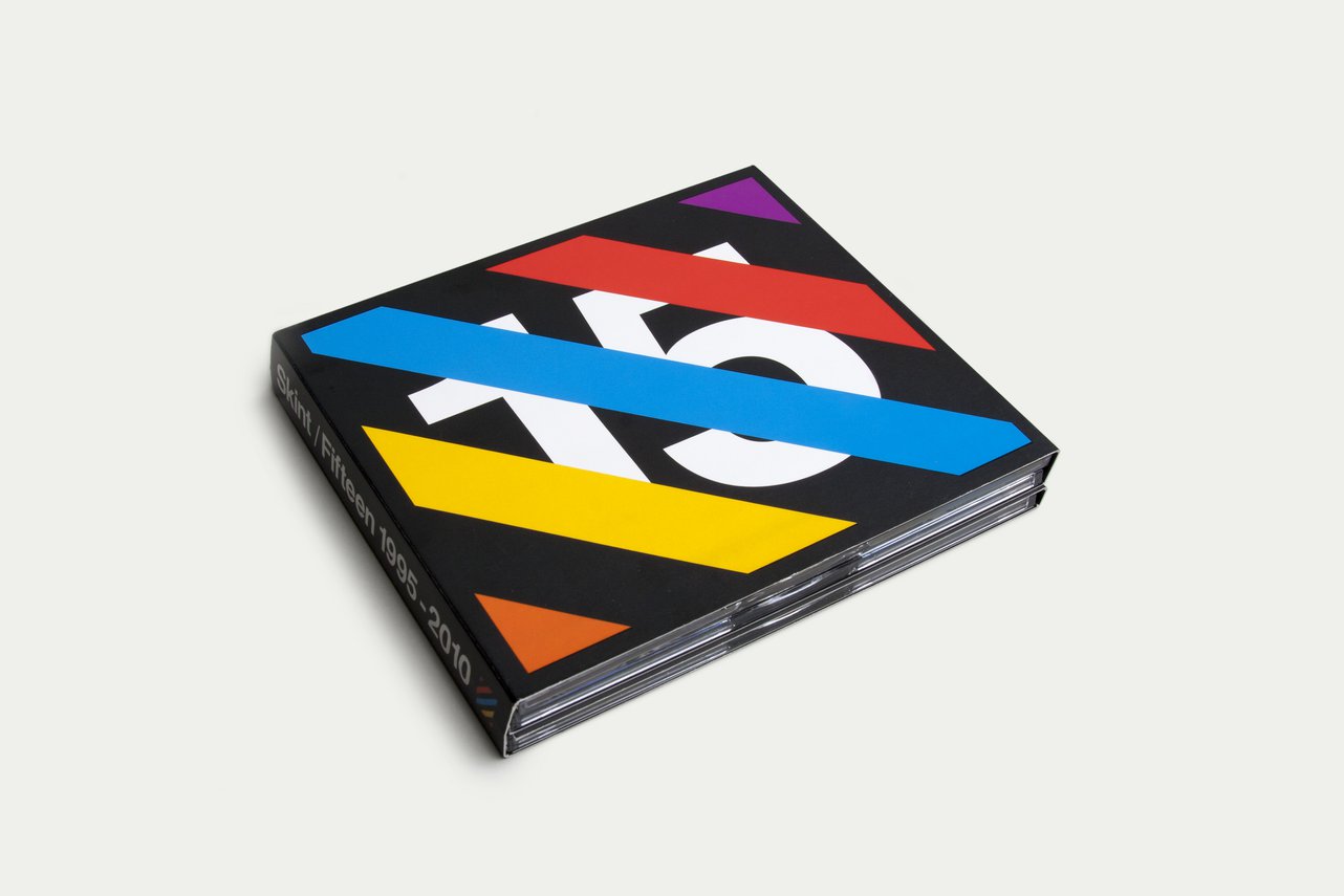
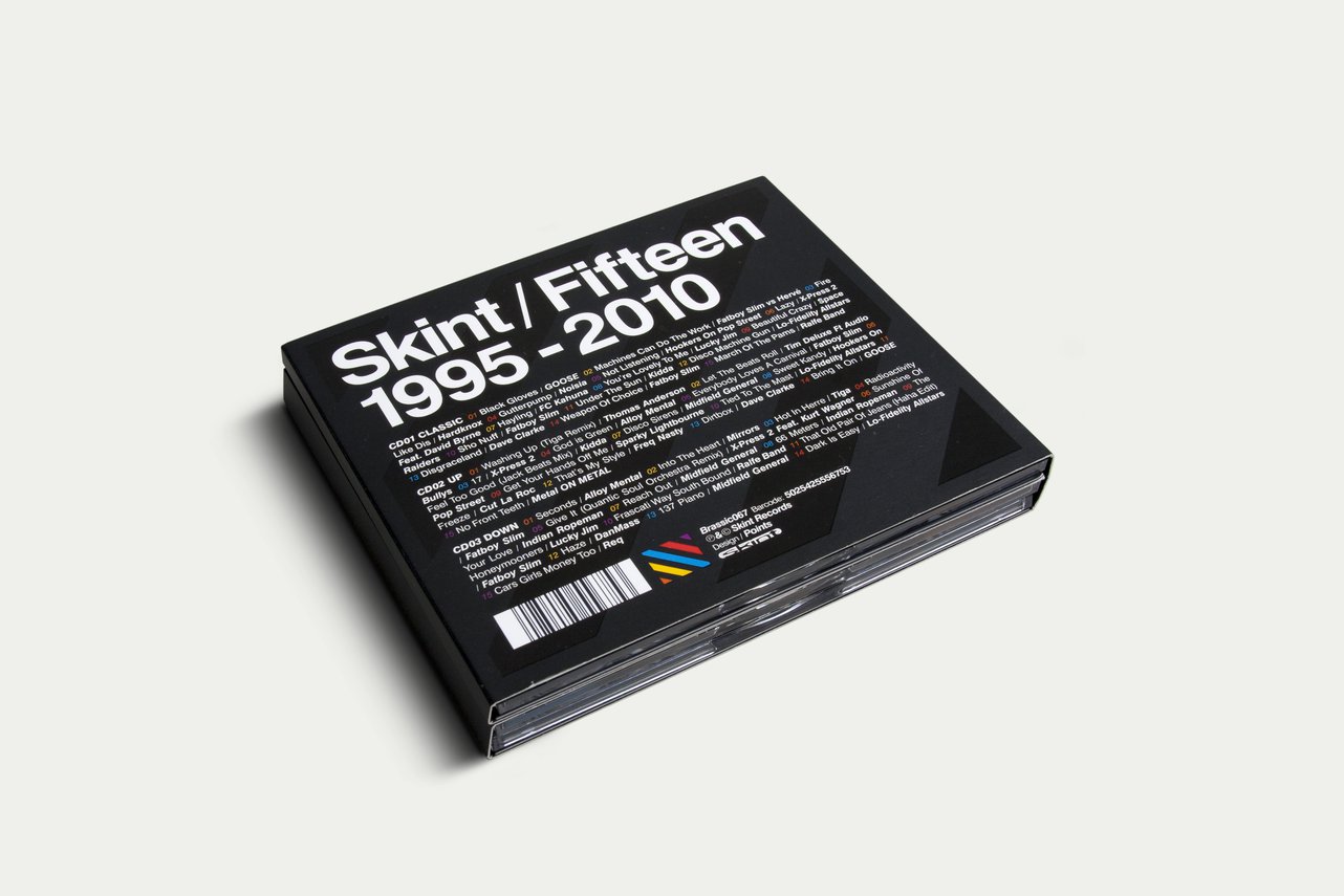
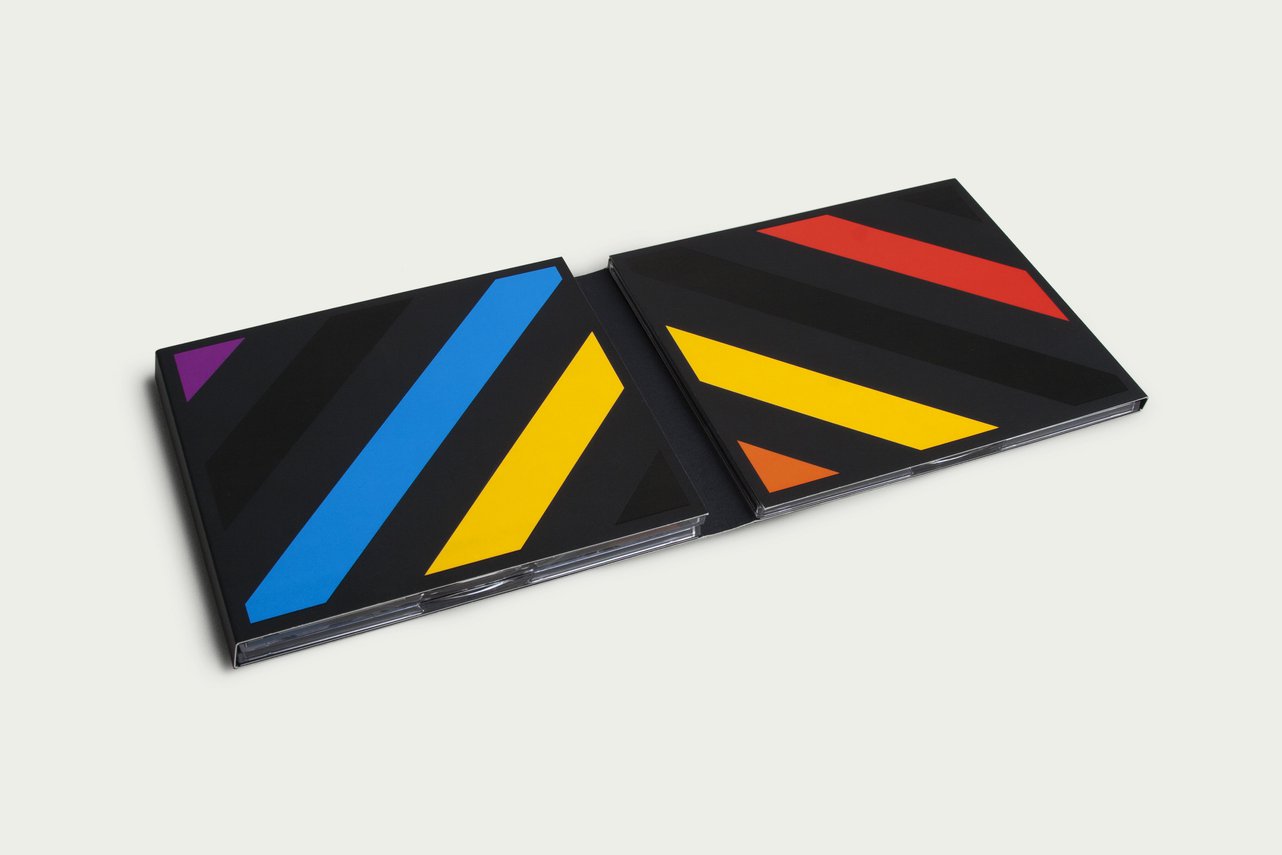
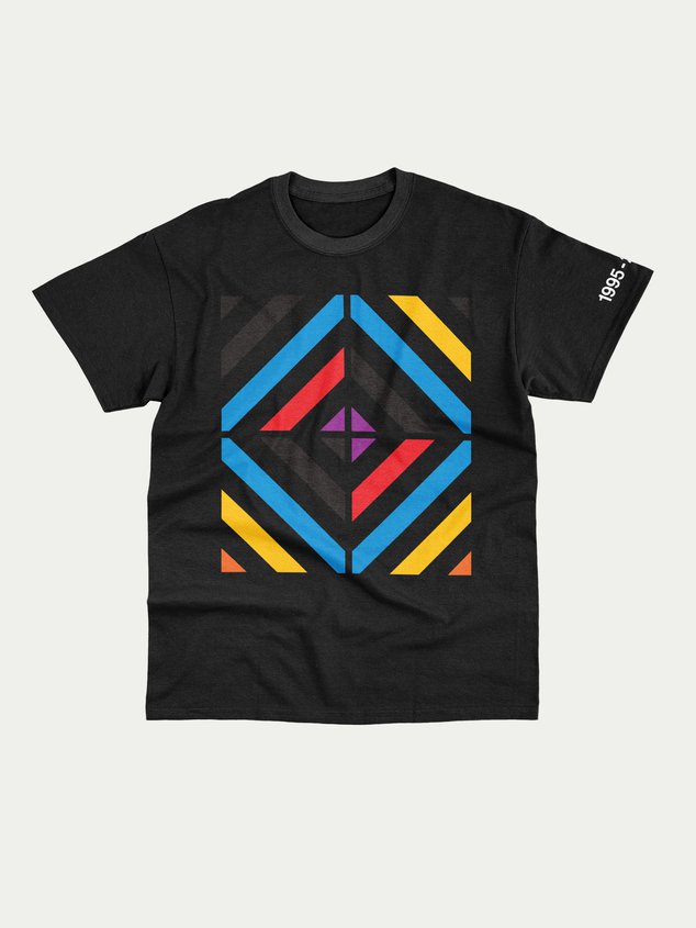
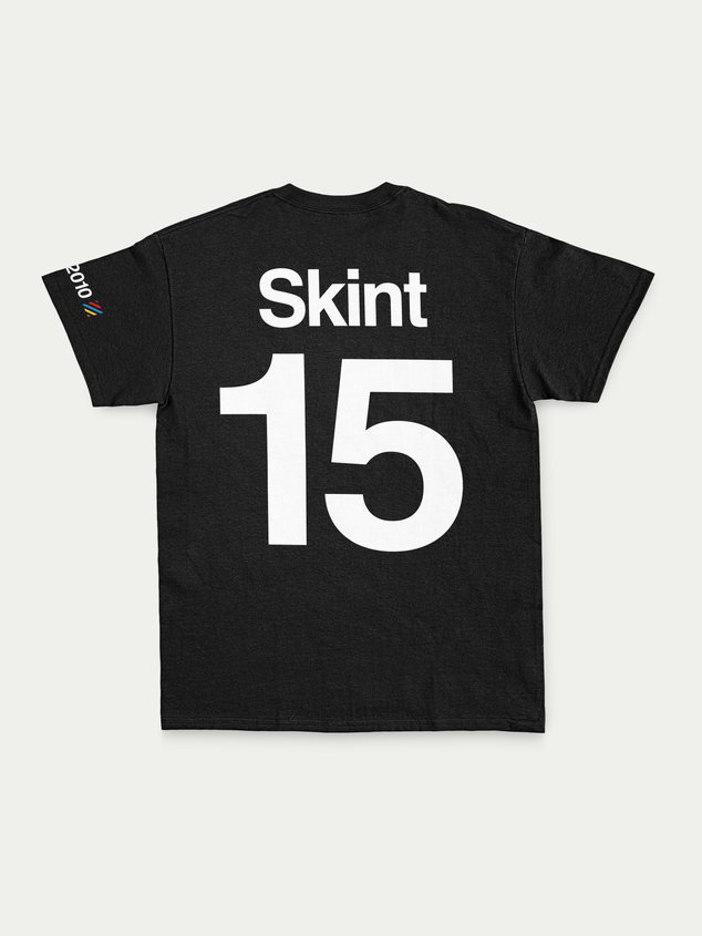
This led us to explore a more esoteric approach than simply using images of nightcrawlers. It’s hard to visualise something as intangible as “sound” without resorting to design clichés. However, one element of the club scene that’s highly visual and underrepresented in music packaging was the lighting rigs – the structures used to shine a spotlight (or strobe lights) on the action. From small-town, sticky-floored discotheques right up to the super clubs – ”disco lights” are inseparable from the music. In some ways, the lighting rigs don’t just support the lights, they hold the entire experience together. We drew on this striking and effective concept to develop a “lightbox” concept that allowed us to generate any number of patterns while retaining the core aesthetic and colour palette.
This gave us the best of both worlds: variety and consistency. The result was a visual brand that stood out on the dance floor of music brands – a tasteful, left-field concept that perfectly captured what Skint Records has always been about.
"Points led a campaign that celebrated an important milestone for Skint. They were sensitive to our history and audience while guiding us in a special and unique direction that perfectly reflected our ambitions for the product. If only we could have worked with Points on every release as their approach and ideas were second to none. They listened to our needs and ideas, then cranked the creativity up to 11.”
What we did
Art Direction
Campaign Identity
Digital Design
Graphic Design
Marketing Collateral
Motion Graphics
Packaging
Project Management
Campaign Identity
Digital Design
Graphic Design
Marketing Collateral
Motion Graphics
Packaging
Project Management
07 04
26
GMT
These are a few projects we've done for others. If you're curious to see what we can do for you, we'd love to talk.
